Meadow Design System
Creating, scaling and evolving a brand and design system.
When I joined Meadow, the brand was a logo and a primary blue. Everything else was open. I took that as an opportunity to define the visual direction and build their design system from the ground up, starting with an audit of existing patterns across their one existing product and marketing site.
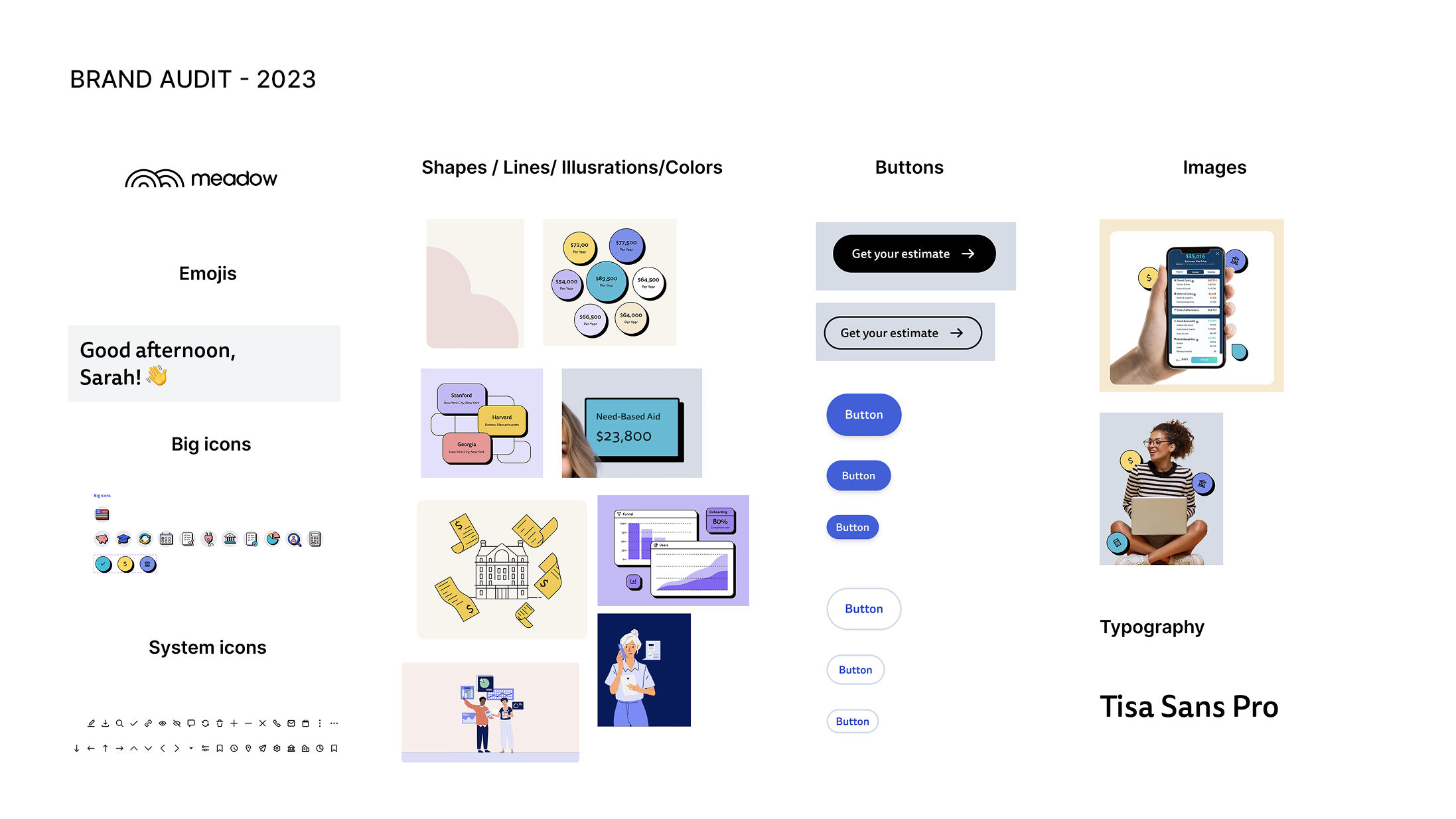
The styles felt scattered and retro, the result of multiple designers working without a shared direction. I wanted to move Meadow toward something simpler, cleaner, and modern that was easy to scale. To get into product work quickly, I started with the essentials: logo, typography, color, and form fields, then expanded the system from there as the work required it.
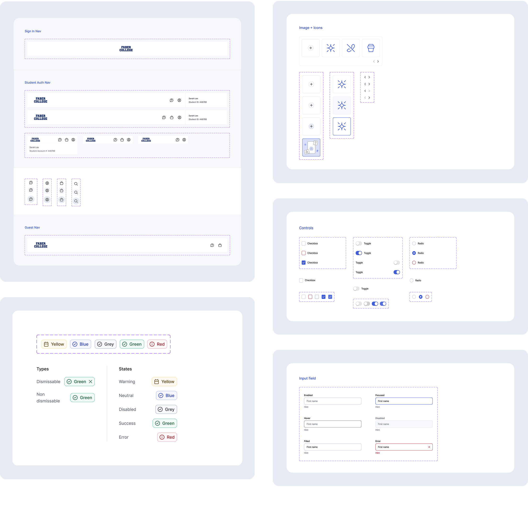
To give the system a home beyond design files, I partnered with engineering to mirror it in Storybook. That gave the team a single source of truth for components and a clear process for versioning and sharing updates.
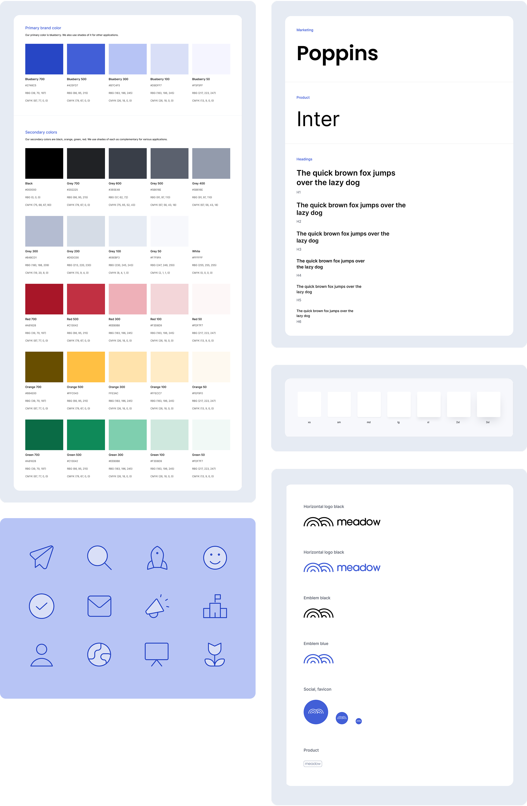
From the beginning I put guidelines in place around icon usage and other styles. As the design team grew, those guardrails meant new designers could contribute without compromising consistency.
As the product expanded, so did the system. I kept building out the component library and brought new hires into that work early, making system thinking part of how the team operated from the start.
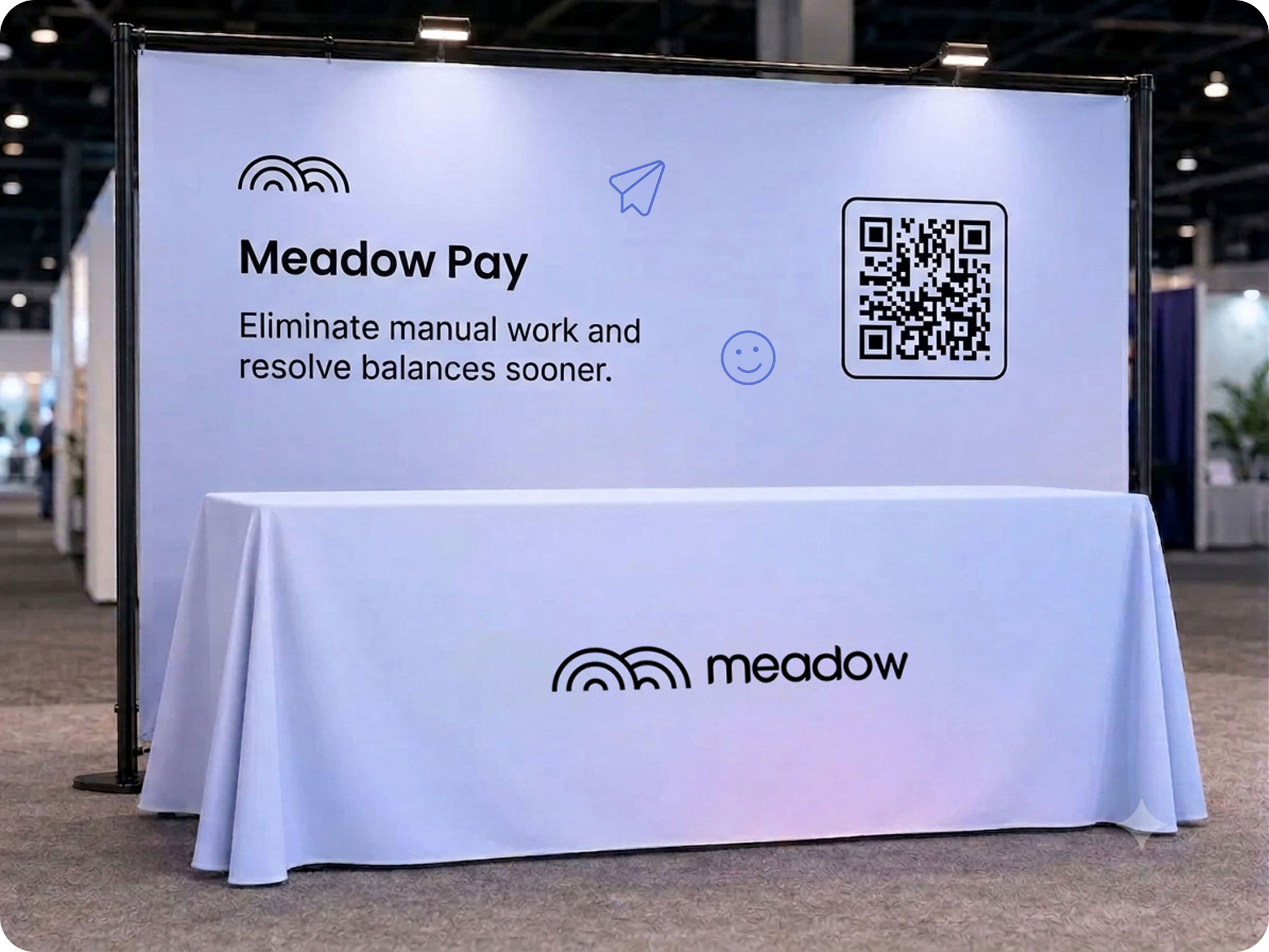
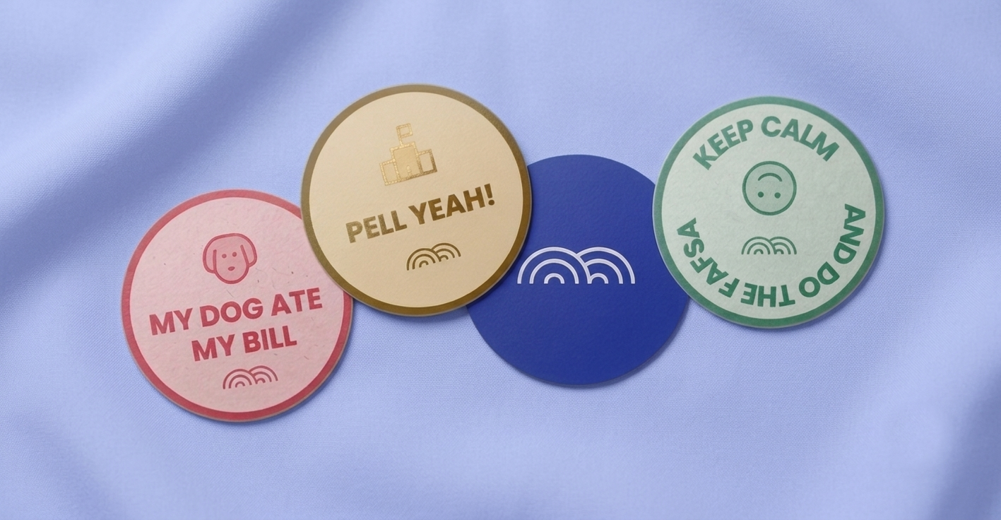
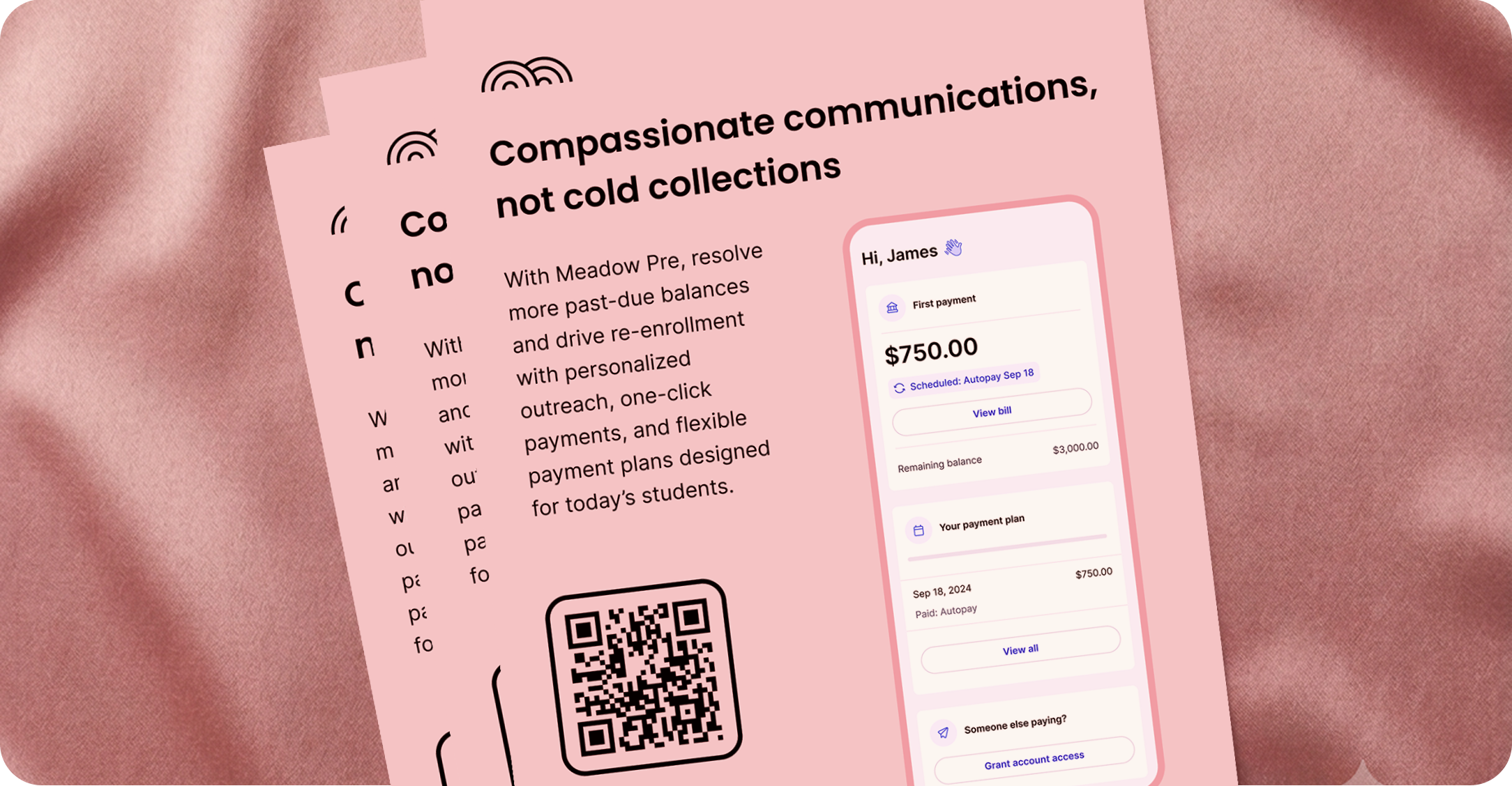
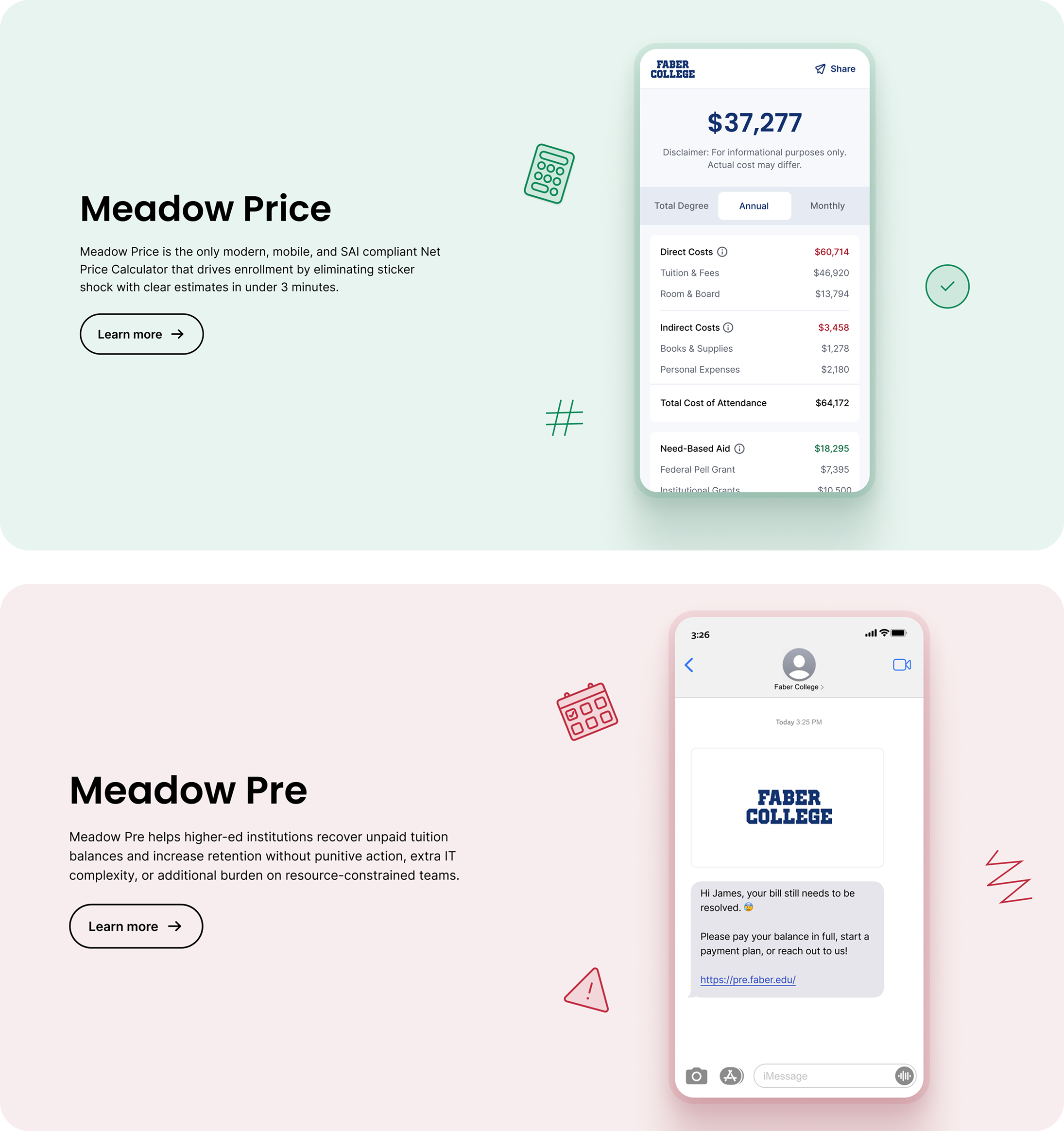
I worked with a freelance designer to art direct and create an illustration style that we could use across marketing and product promotions, applying primary colors to give each product its own personality. Below are a few examples of the brand in use across different mediums.
Lastly we also needed physical presence at conferences for the sale team to not only look good but be able to stand out amongst the crowds as well as get the point across of what our products were from any distance.